Creating Algorithmic Sentience
In the second part of my “Sentient Machines” residency at Baltan Laboratories, I focused on prototyping the game interactions for the multiparticipant environment. During the residency I worked with Tim Bosje and Marion Traenkle.
We did a playtest on June 6 with 7 participants. As we had to put out the call for the playtest long before we created the larp/game, I gave the name Algorithmic Sentience to the larp in reference to the name of the residency program at Baltan: Sentient Machines, and highlighting the focus for the game: exploring both how algorithms change our ‘sentience’ as well as posing the question whether there is a ‘sentience’ of the algorithms.
In this report, I reflect on the design process, the playtest and the feedback, and what we want to change before the next playtest.
the announcement
Sentience is the capacity to feel, perceive or experience subjectively. Algorithmic sentience is a physical game or larp that explores how algorithms may influence our perception of the world. What senses does an algorithm have? What decisions do we let the algorithm take? How are these decisions executed? How do these decisions affect our experience of the world and our relationship with each other? What is our relationship to the algorithms? Participants in the larp will play humans or algorithms. The interactions between them will be governed by metatechniques/game mechanics that simulate how future technologies may mediate our senses.
designing the game/larp
To design the game/larp, I first sat together with Tim Bosje for two days to discuss the various elements that should be part of the game. This resulted in lots of post-its and a number of large flipover sheets of texts.
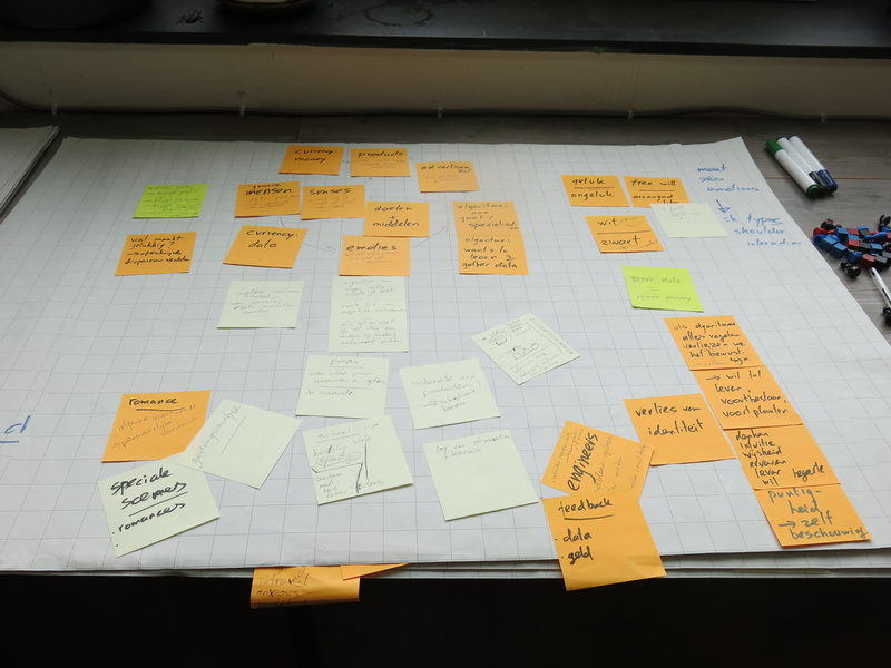
Gathering first concepts.
The main theme emerged from our gathering of ideas: a simulation game that shows how our choices for products are more and more influenced by algorithms that act on our data. An important factor in this is also that there are limited resources available to buy products, and that often the choice to provide data (e.g. by sharing on social media, getting a customer card) is motivated by offering discounts or bonuses, and ‘being able to provide you with customised offers’.
character types or roles
We wanted to look at the interaction between three different roles in this process:
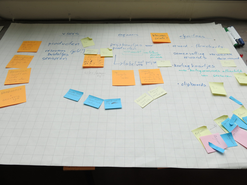
Different character types in the game.
- users - people living their lives in the world and having certain needs they need to fulfill during their lives. They have preferences for certain products, a limited amount of resources to obtain these products and a personality.
- engineers - are people who like to solve problems in the world. They are clever people, who know how to program, who design agents, and who are paid by companies to find ways to sell their products best. They also have a personality.
- agents (or algorithms, we renamed the character type at some point in the development) - created by the engineers to solve a class of problems. They can perform calculation, data processing and automated reasoning tasks. They will observe the users and based on the instructions for dealing with the data from their observations, they will influence the users to make the best choice in products.
Within the game one engineer would design one agent who would interact with one user, so there were teams of three in a sense. The users and engineers could interact with each other as well, but not the agents (apart from the sharing phase).
game flow
The game takes place in three different eras: three different time periods in the user’s lives, where algorithms will take more and more influence on their lives. Between these different eras, the users will have chosen certain sensors that will give the agent more information to better help the user and make the user happier in life. And of course, there would be inflation between the eras: product costs would go up.
Within each era, there are different phases that will be repeated three times within the era:
- Choosing: here the user, helped by the agent, will choose a product.
- Sharing: the user is given the option to share information about their choice and how they feel about it. The agent will show what is shared to other users, who may react on it.
- Moving in the world: here the users will move around in the world (the open space we have created) and the users can interact with each other through touching on the shoulder. In the meantime the agent reports back to the engineer with the data that is gathered and how the agent has performed. The engineer may then make improvements to the agent.
reinforcement learning
For the agents, I decided to focus on the concept of reinforcement learning, which is an approach from AI (artificial intelligence) computing that is quite commonly used, and which also gives the agent some freedom in choosing actions to take. In other words: it seemed performable by human players.
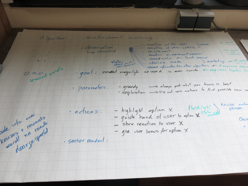
Reinforcement learning within the game.
The basic concept is that an agent with reinforcement learning can take actions in an environment, and then observe that environment. The engineer designing the algorithm determines how much reward the agent gets for certain observations. The agent can then explore the reward gained for the different actions and try to maximise the total reward gained. The agent can be explorative: try unexplored actions to see if they give a high reward, or be greedy: stick to already explored actions that the agent knows will yield a high reward.
space and light design
The initial idea we had for the space was to have three or four (depending on the amount of players) different stations where the users would make a choice guided by the agent. Then the space in the middle would be used to move around in the world.
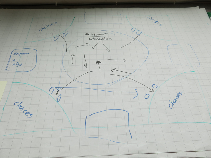
Initial space concept.
Discussing with Marion and looking at the spatial layout of the space we had available at Baltan Laboratories, we adapted the spatial layout into three zones:
- the moving area, where the users would interact with each other)
- the choosing area, where the users would each interact with their agent. From this area the agents would also be able to observe the users in the moving area.
- the engineer area, where the engineers would interact with each other. The agents would move between the choosing area and the engineer area. The engineers would be with their back to the other areas.
By separating the areas in this way, there would be a clear choreography for the different characters.
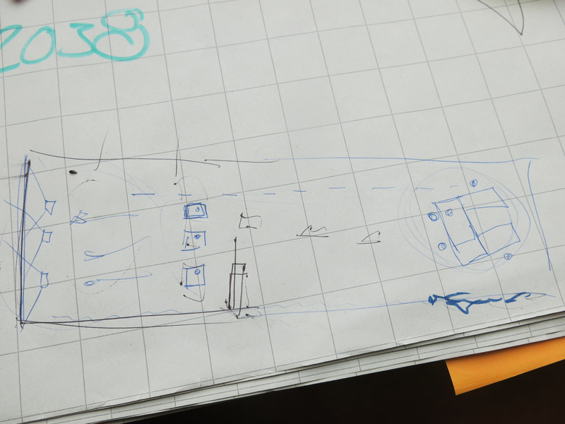
Final space concept for the Baltan Laboratories space setup.
For the light design, we chose to use RGB led pars to shine on the white back wall of the space (which is normally used for projections). Shining light on this white wall, gave enough reflection into the space to give an athmosphere to the moving area.
The light is used in the game to reflect the most common emotion of the users: so we had different light patterns with changing color and intensity, designed for the three emotions: happy, sad and angry. Similarly, we had musical melodies for each of these emotions, which would be played during the moving phase.
playing the game
We first introduced the players into the game through a workshop. In this way we introduced the different types of characters, the game flow and the mechanics used in the game to simulate interactions through technology.
movement and touch
Within the game we use movement and touch as a way to express how the users feel. Within the workshop, this was one of the first exercises to let the players loosen up and at the same time prepare the movements and touch interactions they would have during the game.
After the movements were made, we asked each of them to analyse their own movements and touch interactions to classify them using our sensor simulation.
The motion sensor would be able to detect two features: whether a movement was linear and circular and had a low or high intensity. By distinguishing these features, a unique combination would allow a classification to map to the emotion the movement signified. Later on in the workshop, the engineers would use the data set gathered from this analysis to build the algorithm for movement classification that the agents would use.
After the game I analysed the different movement algorithms and summarised the results (see the image below). What is interesting in the result is that the different players agreed on how intensity of the movement matched emotions, but that there were slight differences in the linear or circular features, although there was a clear majority for certain types as well. During the movement exercise, we encouraged the players to create their own movement, but of course, people did copy each other’s movements as well. And of course, there is body language (culturally defined) that also plays a role in the choices the players made in their movement creation.
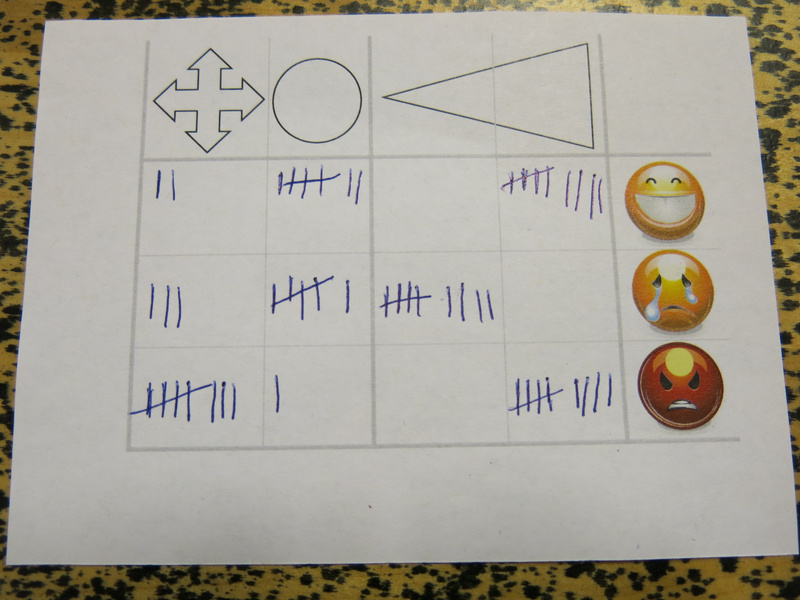
Summarised algorithm for the movement classification.
For the touch: we limited the touch interaction to be on the shoulder. We indicated to the players that that was where the sensor would be. This was inspired by the touch garment made during the first residency.
The simulated sensor would be able to detect the location of the touch (at the back, front and/or side of the shoulder) and the intensity. The players could draw the location in a prepared sheet. The intensity indication was the same as for the movement.
Again, after the game, I summarised the results; it was a bit hard to ‘count’ the location, but I just was drawing more often on the same location if a location was present more often. In the image below: the top triangle is the back of the shoulder, and the bottom triangle the front of the shoulder. What is interesting to see in the summary is again that the intensity is fairly consistent, but the location varies quite a bit.
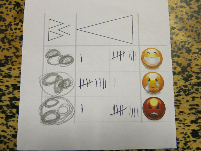
Summarised algorithm for the touch classification.
The aim for designing the algorithms in this way for the game, was to give the players a sense of how engineers deal with training data in the design of an algorithm. They have a limited set of test data (each engineer only got two or three of these analysis cards to work with), may use their own assumptions (the engineer players also took part in the exercise), and do not necessarily know what exactly the data represents in the real world (the engineers had no accompanying video recording of the movement and they did not know who of the other players made the movement that the analysis corresponded with).
In the further development of the project, I might use some of the results of these movement creations and analysis to train the algorithms that are used on the actual sensors. From the data gathered, it seems that there is a quite a bit of correlation between the features the sensors detected and the classification. Of course, as with a lot of gesture classification algorithms: the algorithm does not account for the fact that there may be other movements and touch interactions that also fit these features, but do not correspond to the classified emotion.
character creation
Within the game, the products were abstract things with three different features: color, shape and a stamp A or B.
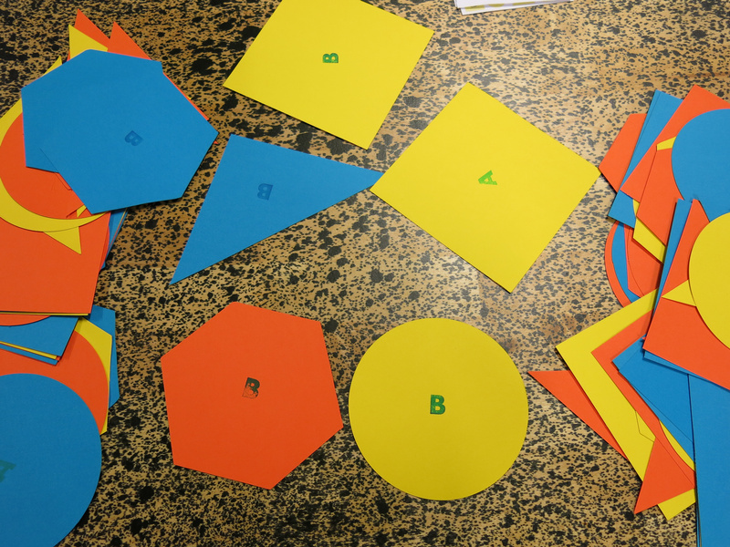
The different types of products in the game.
The users would pick a product preference, by drawing three cards: one for the shape, one for the color and one for product type A or B. If all three features would match for the product they would choose, they would be most excited, if none matched, they would not be excited at all. It was up to the player to determine what emotion their excitement about their choice would match.
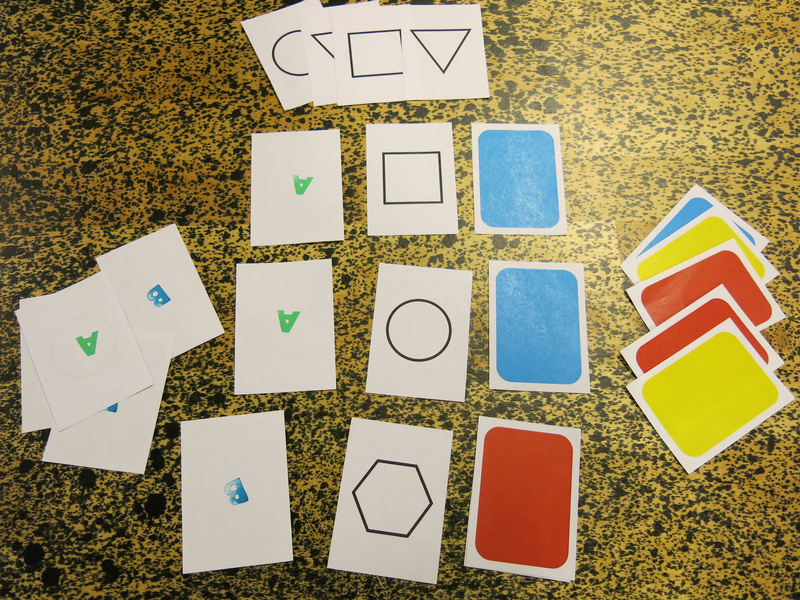
The product preference cards.
In addition to their product preference, they would also have a personality trait, that would suggest another hint on how to play the character, e.g. how willing she would be to embrace new technologies, to share her feelings or to spend resources.
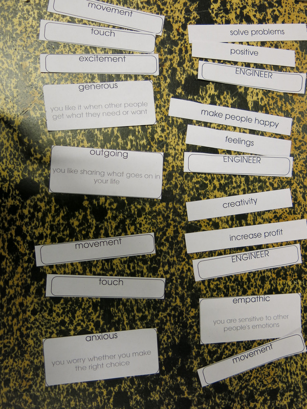
The different personality traits of the users and engineers. Also shown are the sensors that the users chose between the two eras.
The engineers also had personality traits, they had a drive: their motivation as an engineer, and a way of discussing, inspired by the theory of the six thinking hats of Edward De Bono.
The main task for the engineers was to design the agents’ reinforcement learning algorithm. For this we had created a flow chart in which they could assign reward points to different observed parameters. The idea was that for each possible emotion as a result of a product chosen, the engineer would assign points, and the agent would fill in the flowchart during the phases to determine the reward gained for a certain action to push the user to make a certain choice. The actions the agent could take were different ways of influencing the users’ choice: highlighting a certain choice with the light on the choosing table, giving a discount on a product, or hiding the other products. Using these actions would have a negative reward.
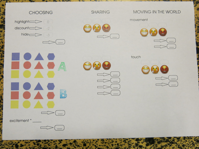
The flowchart used by the engineers and agents.
What proved difficult was the amount of things to fill in for the engineer all at once. Feedback from the players was to build it up more during the game, adding things with each era, and add more description to the sheet, rather than just having the images. Another idea that came up was to distribute the sheet more between the agents and engineers: that the agents would just do the observations and fill in a form according to that, and that they would then go to the engineer who would then give them the reward for the choice they made.
Also, awarding points for the products that were chosen could be made simpler, by just giving points per feature, rather than per product.
That would make the role of the agent a bit easier and the role of the engineer a bit more important during the game. The agent could then still use the sheet for recording what reward to expect for which user choice.
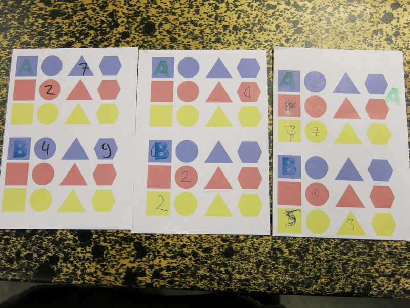
The sheet for the agent to track the rewards for particular choices.
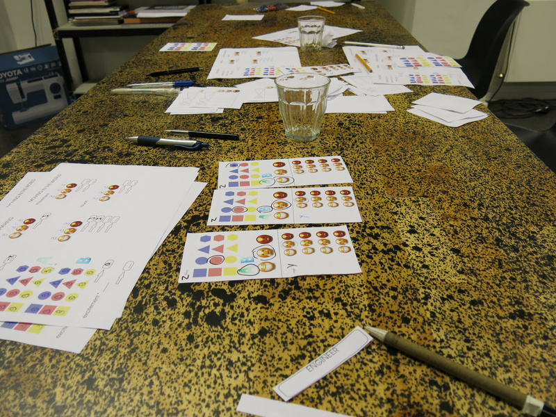
The engineer table after the game, filled with data sheets and previous versions of the flowchart.
social media interaction
Social media interactions were simulated with a sheet, where the user’s choice was indicated, and the user could then point to the emotion she was feeling. The agent would then give the sheet to the other agents, who would let their user react on the choice.
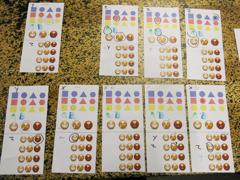
The social media sharing sheets of the game.
During the playtest we ran out of sharing sheets (due to a miscalculation of how many to print) and Tim suggested to use a more physical way of sharing the choice: standing on a chair in the middle of the world and expression the emotion in movement while showing the choice made. This was a very interesting direction to take: it makes the act of sharing very theatrical, and is a nice commentary on the exhibitionism of sharing on social media.
reflection
After the playtest we had a discussion with the players on what they experienced during the game and what aspects could be changed or improved. Marion, Tim and me had a discussion afterwards as well to discuss future directions.
Some of this feedback on the game design elements is already mentioned in the text above, I will continue in more detail here.
physical and verbal interaction
One of the first aspects to look at is to make the game more physical and theatrical: right now the game uses a lot of elements which are a lot like board game mechanisms (using the paper sheets). A first step was to make the social media interaction more theatrical. So next, we need to figure out which other elements we can make more physical.
Originally I imagined the interaction between the agents and users to be completely non-verbal. As we did not explicitly mention this in the introduction, the interaction turned out to be much more verbal and the software agents became more like sales agents. In a sense, this is a parallel that is quite fitting. Also the interaction between the engineer and agent became much more verbal than I expected.
the role of the agents
The agents are the connection between the engineers and the users, so they play an important role in the game.
One of the players described how she played the agent, really analysing the movement and touch interaction based on the features we defined for the classification algorithms. It was important here to unlearn the human ability to read body language and to not look at facial expressions. This aspect of playing the agent can be stressed more during the preparation workshop. It might also help (as mentioned above) to change the flowchart sheet and instead give the agents an observation list, which is then evaluated by the engineers. Then the agents can focus on the observation of the movement and touch interaction, without giving an interpretation to it. Also the reward could be made more physical to also use game tokens for these, so the reward for the agents would also be more tangible.
Another suggestion was to remove the distinct phases (choosing, sharing, moving) and instead have the agents mingle with the users and explicitly offer them products, seduce them to make choices. The engineers would then give the agents more explicitly products to sell. Agents would then also interact with multiple users and the agent + engineer team would try to optimise their profit. The role of the agent would then even more explicitly be similar to a sales agent. I also like the image of an agent with a flipchart filling in observations.
role of the engineers
The role of the engineers was most removed from the user experience, which was intended for the game. A suggestion of one of the players was to allow the engineers at least during the ‘test round’ to see what is going on in the world, so they would have some idea. This could be explained within the fiction of the game as a kind of ‘user testing’ phase which is common in engineering.
The link between the products that were sold and which products to push - a factor that would be determined by the advertisers hiring the engineers - was not worked out well enough yet before the playtest. Before the next playtest we will need to make this factor more explicit, so that the engineers have some way of knowing that they are doing well, and also give them an extrinsic force against which they have to make decisions.
The selection of products to sell could also be determined by the engineers, so they would have more direct influence on what the users could choose from. Now the product selection was too limited and the engineers did not know what the available choices were, which resulted in the engineers having too little information to base their evaluation of the agent’s performance on.
Besides the data provided by the agent, also the verbal feedback from the agents was found useful for the engineers to make their decisions, as it gave a bit more clear idea of what was going on in the world.
What the engineers did find out during the game, was that the users had a clear preference for products with the letter “A” on it.
learning the game
A handout for players with an overview of the game would be useful, so the players do not have to rely on just the verbal instructions given during the preparation workshop.
game flow
On a practical level the game flow was a bit hard; the players could not distinguish clearly enough between the sounds of the different phases, and for myself controlling the sound, it was also hard to time the sounds, as I had trouble figuring out from a distance how far players were. Having a clearer idea of how long each phase should be, would have improved this, and also training the players more in recognising the sounds so they would feel the time pressure of each phase. I also imagined the moving phase to last a bit longer than that the users actually needed to move around.
Above it was suggested to change the game flow and rather than using phases, they could be mixed. Then the agents would move between the users to seduce them to buy products. The users would have a minimum amount of products they would need to buy during each era, but could buy more. The agents could then also use a larger variety of actions to seduce the users, and more products could be bought during each era (which in turn would increase the amount of data gathered by the agents and make the influence they can have larger).
Perhaps it is an idea that the users interact non-verbally, using the movement and touch interactions that are designed, but that the agents can whisper to the users to seduce them.
tensions for each role
Finally, what we need to carefully think about is how to make the tensions for each of the roles more explicitly present in the game.
For the user there is the tension between having a free choice and being forced to give up data to be able to obtain the needed products and getting less choice over time.
For the engineer it is the tension between making profit (to survive as a company) and the drive to make the world a happier place. Happiness vs. profit - and can they coexist?
For the agent, the influence of the reward should be made more important. Perhaps there is a performance measurement that the engineer uses, and if the agent does not perform well enough they will be discarded, or reprogrammed to such an extent that they are no longer themselves. How many modifications can be made to a software agent before it looses its identity?
credits
In our game materials we used emoticons from the GNOME-icon-theme (version 3) created by GNOME icon artists. These emoticons are licensed with the Creative Commons Attribution-Share Alike 3.0 Unported license.
The game materials were created using the libre, open source desktop publishing program Scribus. Some of the default shapes from the program are used in the game materials.